Corneliani Shanghai

Flagship store

The value of a brand
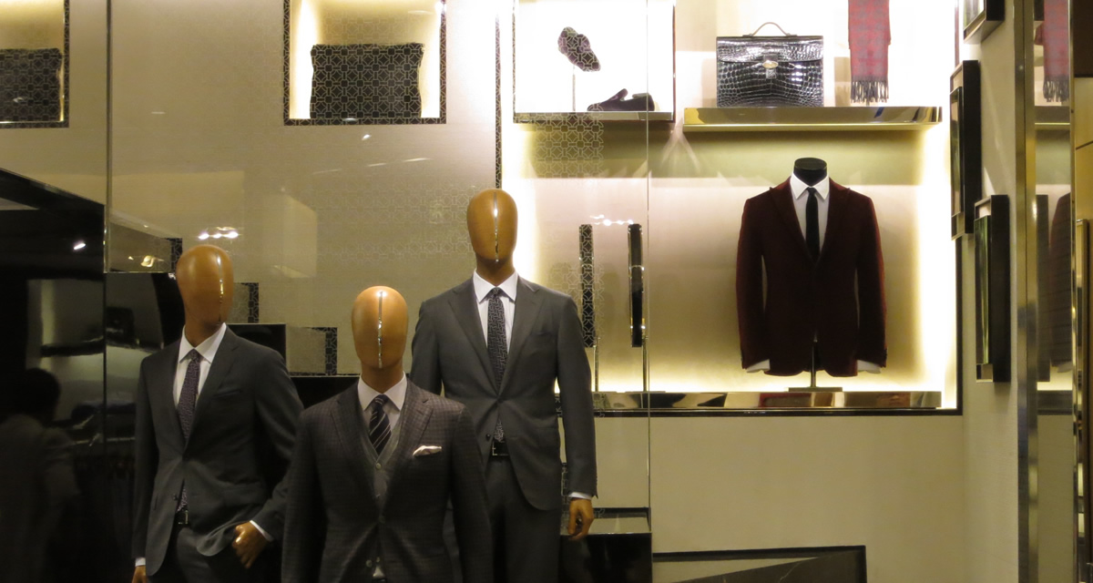
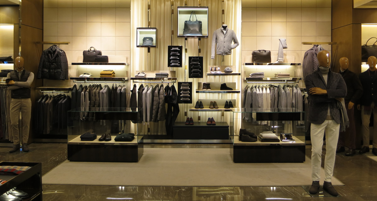
The new Corneliani boutique in Shanghai has been the perfect occasion to see once more the architectural and decorative elements that express the Mantua brand identity values, in line – though updated – with the flagship on via Monte Napoleone, in Milan.
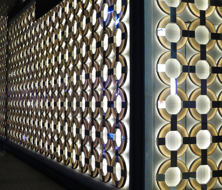
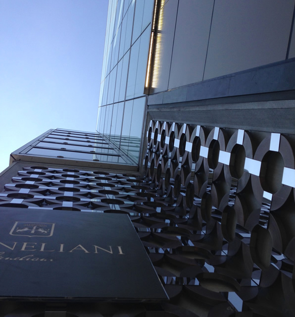
A unique façade
The most striking feature is certainly the façade. For the first time, the Mantua brand is compelled to be represented in a univocal and ultimate manner on a very important external surface, the Citic Square, one of the most famous Chinese luxury malls, and in Shanghai, the economic and, in a way, cultural and social capital of the great Asian country.

The origins of a “brand”
We decided to go back to the origins, to Mantua- so rich and full of ideas, and where the bond with the Cornelianis is still very strong- to recover treasures of the Italian Renaissance, Mantegna’s painting and the Gonzaga Family’s Ducal Palace.

One of the most exclusive luxury shopping centres in Shanghai.
The Mantua brand throughout the entire façade.

Brand pattern conception

The choice has been both simple and radical: this is not an ex nihilo creation that is hard or impossible to justify or an attempt to render abroad the architectural decoration motifs that characterise the interiors of all Corneliani boutiques (such as the weft-warp weaving of the wood panels made of solid macassar ebony, which was created for the interiors of the Milan boutique around two years ago, in order to be appreciated on small surfaces and at close range).

We have also immediately rejected the idea of creating a generic abstract geometric motif or a geometric repetition of the logo monograms, just like many luxury international brands do, because the results of the identity brand-to-motif bond in customers’ minds require very long times and years of investments in advertising in this sense.

The choice originated from the natural figurative and creative process that we have developed during our university training; we have invented it (invent=find) easily, almost naturally, on the tip of our pencils, bringing it back from our youth studies on the Renaissance, mainly in Florence and Mantua.

The Mantegna motif

The Mantegna decorative motif par excellence is the circle, the perfect motif, the circular ‘ring’ matrix, which is the background of the portraits of the Gonzaga family at the Camera Picta (latin for ‘Painted Chamber’) of the Ducal Palace of Mantua.

A ‘perfect’ motif not only because it is strongly linked to Corneliani’s identity in the region and to the best culture too, but also because it is a motif that can be appreciated in the East as well, as an homage to Chinese culture, which considers the circle to be a positive and good omen symbol.

The Mantegna ring motif, therefore, combines a strong cultural bond with the land and identifiability in terms of iconography, thus ensuring an easy identification of the brand in any type of context, especially in Asian cities that absorb the news of a new urban profile within a very short time.

Historical and cultural roots
Transformated into a modern logo

The origin of the motif – which was actually ‘redesigned’ by Andrea Mantegna himself who took inspiration from a particular motif of Donatello’s Altare del Santo (Altar of the Saint) in Padua – is commonly ascribed by historians to one of the most peculiar Roman monuments: the tomb of Marcus Vergilius Eurysaces the Baker (the rings here open on a smooth surface simulating furnace doors or – according to some – the containers used to work the flour).

From the marble that was painted by Mantegna, and then by his pupils who carried it to the façades of the city, the motif was dematerialised and made bright with warm LED lights to highlight the new ‘Corneliani landmark’ mainly in the evening and at night, the most important times for shopping and urban communication.

The interiors of the store

The new Corneliani logo accompanies visitors also inside the mall, enfolding all the store internal façades like a big perforated and illuminated foulard, but here the dimensional scale is slightly reduced (the overall diameter is around 30 cm) and the materials are also different: here since we find the typical materials used in all Corneliani boutiques.

The rings are made of macassar ebony, the interlinking straps are made of polished stainless steel, and the background surface is made of draw-string leather reproducing in the interiors the same hatching as the marble on the outside.

The floor is always made of polished imperial grey marble, even in the changing rooms, where it is partially covered with thin ribbed carpet; the hatching, here as well as in the stone on the façade and in certain microfiber fabrics or curtains, is one of the themes retaken in different variants in the concept store; it is a male theme from shirt lines up to ties and pinstripe suits.

A journey for customers
The store develops mainly on two floors covering a total surface of around 250 square meters, but here, just like in Milan, we have decided to accompany customers along a vertical ‘architectural promenade’ with short stairways decorated by displayed products (mainly leather items).

The creation of a mezzanine enables – at functional level – to increase the exhibition surface and – at emotional level – to play with the effects of space limits, as it has already been widely used in the flagship in Milan, according to Loos’s ‘raumplan’ concept.

External façade

Flagship store

The effect is that of a large perforated surface with rings held together by chromium-plated straps with luminous aim (focus) at the centre, framed by an important clear marble structure, askew shaped, which defines its perimeter and connects it to the other adjacent surfaces by juxtaposition – according to Brunelleschi’s teachings.

The very articulated space of the Shanghai store façade, just like in the next boutiques that will draw inspiration from this one, is distributed, arranged and ruled by the geometry of these frames that seem to stretch this huge perforated fabric on their perimeter.

Light as an architectural mark
The surface on the back of the ‘perforated fabric’, which receives and reflects the lights of the ‘ring’ pattern, is covered with scratch-work marble (another element already used in the main internal walls of the boutique in Milan) arranged with the grain on the board in the centre of each ring, and with bush-hammer work on the surfaces that can be seen in between the rings.

The result is an articulated three-dimensional effect-surface, exalted by the LED lights that turn the centre of the rings into a lot of small light sources reflecting in the night view of the metropolis.

Do you want to see more projects?

Corneliani – Firenze

Flagship Store

Corneliani – Milano

Flagship Store

Corneliani – Paris

Flagship Store

The ermesponti experience

Our end-to-end method
but step-by-step for you.